Caesarea Harbor National Park
Sunday, June 07, 2020
Herod / Harbor / Sea
In a way we can say that King Herod, a man of great cruelty, gave us Caesarea as a gift. Founded under the banner of ‘food and entertainment,’ the city still offers that today, albeit in a somewhat less hedonistic manner.
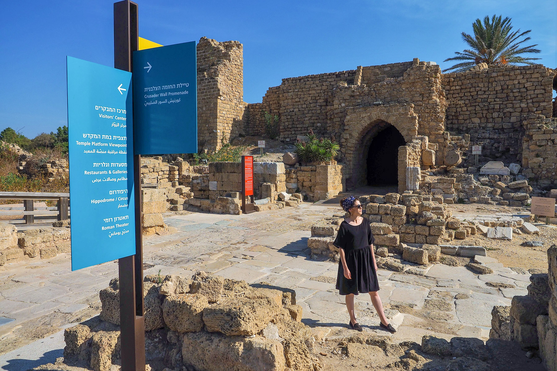
As the most popular historic site in Israel (along with Masada, of course), an effective system of signs was crucial. Some 750,000 visitors a year wander among the ancient remains, and explore the restaurants and galleries in the ancient harbor. The directional and wayfinding signs are a bridge between two worlds, the glory of the past and the enchantment of the present.
We drew inspiration from several sources, first of all from the urban plan of the city. Ancient Caesarea was a state-of-the-art creation. Its main streets, the Cardo and the Decumanus, intersected at right angles, forming the basis of an orthogonal grid – a bit like modern Manhattan perhaps. By the same token, our signposts are central constructions from which the directional signs emerge.
![View of the Praetorium (law court), Caesarea]() Directional sign with the entrance gate in the background
Directional sign with the entrance gate in the background
![Technical details]()
![Technical details]()
As the most popular historic site in Israel (along with Masada, of course), an effective system of signs was crucial. Some 750,000 visitors a year wander among the ancient remains, and explore the restaurants and galleries in the ancient harbor. The directional and wayfinding signs are a bridge between two worlds, the glory of the past and the enchantment of the present.
We drew inspiration from several sources, first of all from the urban plan of the city. Ancient Caesarea was a state-of-the-art creation. Its main streets, the Cardo and the Decumanus, intersected at right angles, forming the basis of an orthogonal grid – a bit like modern Manhattan perhaps. By the same token, our signposts are central constructions from which the directional signs emerge.
 Directional sign with the entrance gate in the background


Directional sign, Caesarea
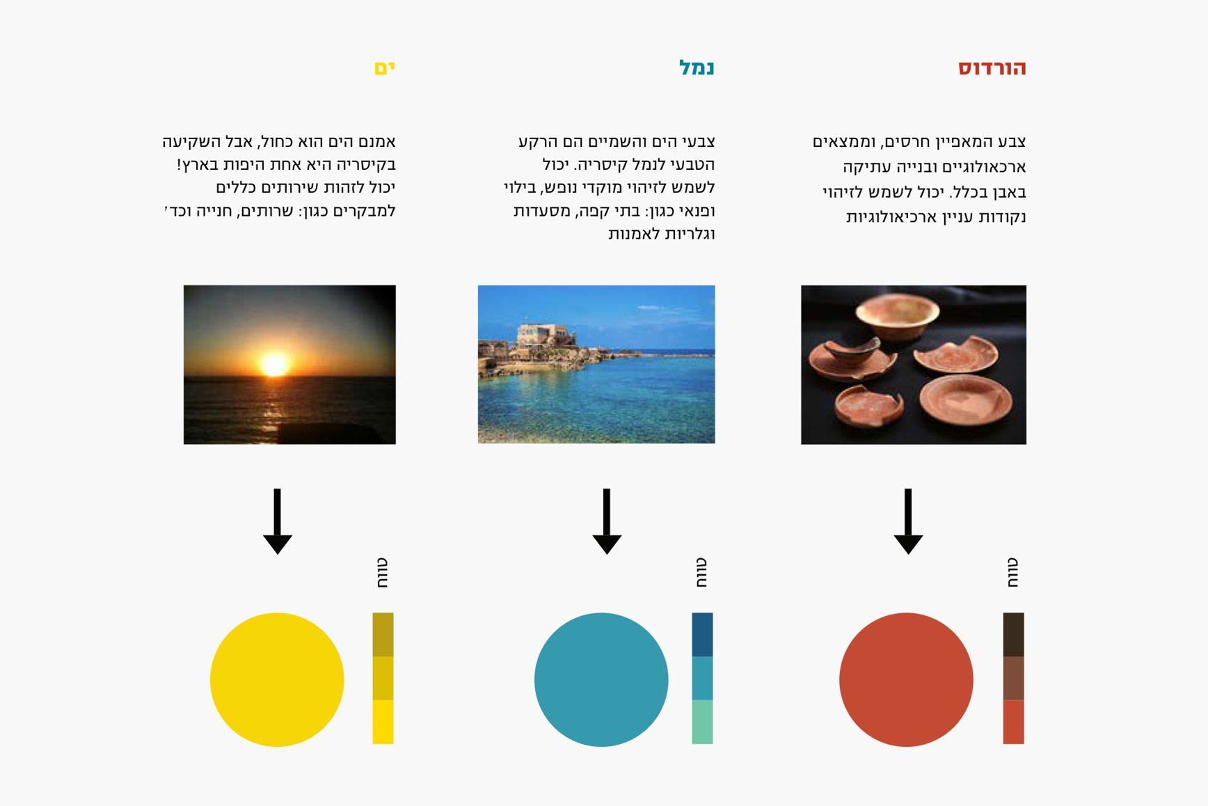
Another concept was to choose colors that reflected the character of different directional signs. We focused on three spheres: Herod and the antiquities were given terracotta orange, typical of ancient pottery. The harbor, with its overtones of leisure-time activity (restaurants; galleries) got the color turquoise. Although the sea is blue, its glorious sunsets made yellow a good choice, but – from the celestial to the earthy – the same color was used for parking and WCs as well.
“Herod and the antiquities were given terracotta orange, typical of ancient pottery”
The structural design of the signs was given an airy transparency so as not to interrupt views of the sea, antiquities and nature. We chose an iron-like brown for the signposts that connect the signs themselves.
Color scheme and visual references
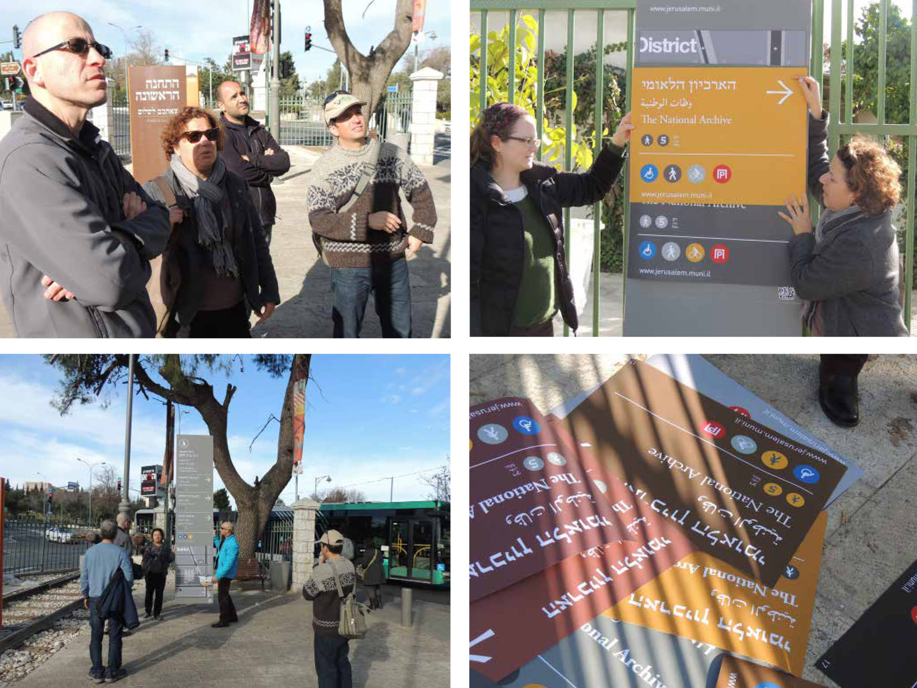
Jerusalem Sign Masterplan
Monday, April 20, 2020
Bringing order to disorder
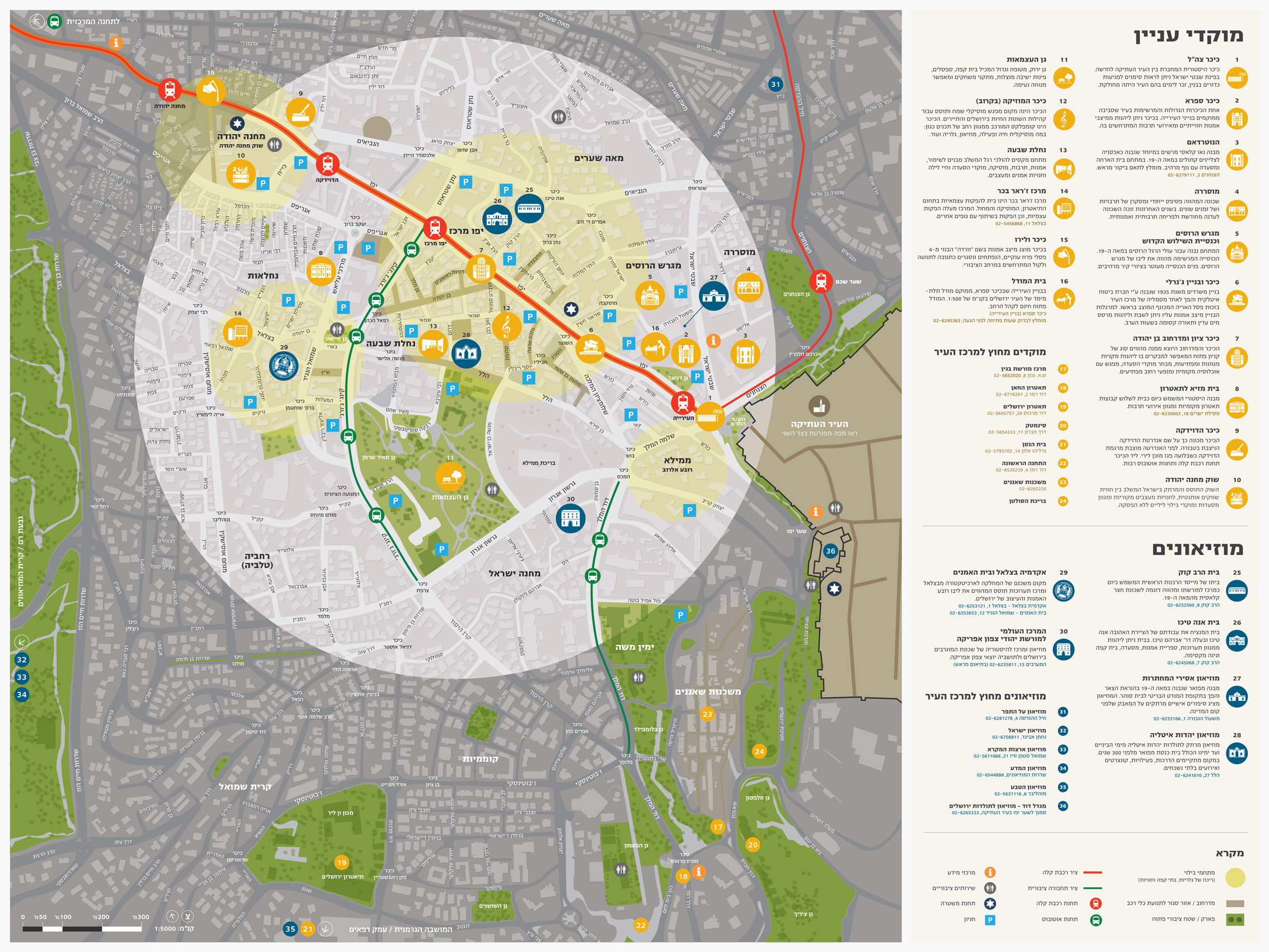
The sign masterplan for central Jerusalem is designed to provide information in public areas, with an emphasis on directional and wayfinding signs. The project was launched in 2010 by Eden, the Jerusalem Center Development Company. The interdisciplinary planning team included project manager Aviad Sar-Shalom, landscape architect Rachelle Wiener, transportation engineer Roli Roshfeld, and ourselves – Kasher Design – responsible for visual communications and wayfinding. With Aviad’s departure for Canada, Avidan Elzas of Hass Engineering took over as team leader. Subsequently, as the project expanded, Doron Rachlevsky was appointed as its director.
The first stage was devoted to documenting the existing situation, analyzing the results, and determining the ‘rules of the game.’ One of our immediate tasks was to sort out and catalogue the different kinds of signage in use, divide them into groups, and define their purpose. In this way we significantly reduced the number of types of signs scattered throughout the city. The next stage was the separation of signs in the private sector (advertisements, commercial signs, etc.) from those intended for the public domain (directional signs, for example).
Rachelle Wiener’s team mapped the area, highlighting the entrances to the city and ranking traffic routes according to the city’s existing transportation masterplan. Mapping the street system identified a network of arterial roads that lead to and across the city center, and connect neighborhoods. The ever-expanding city of Jerusalem is a city of neighborhoods, and therefore the demarcation of each was important, both at the level of local identity, and at the level of wayfinding in the city.
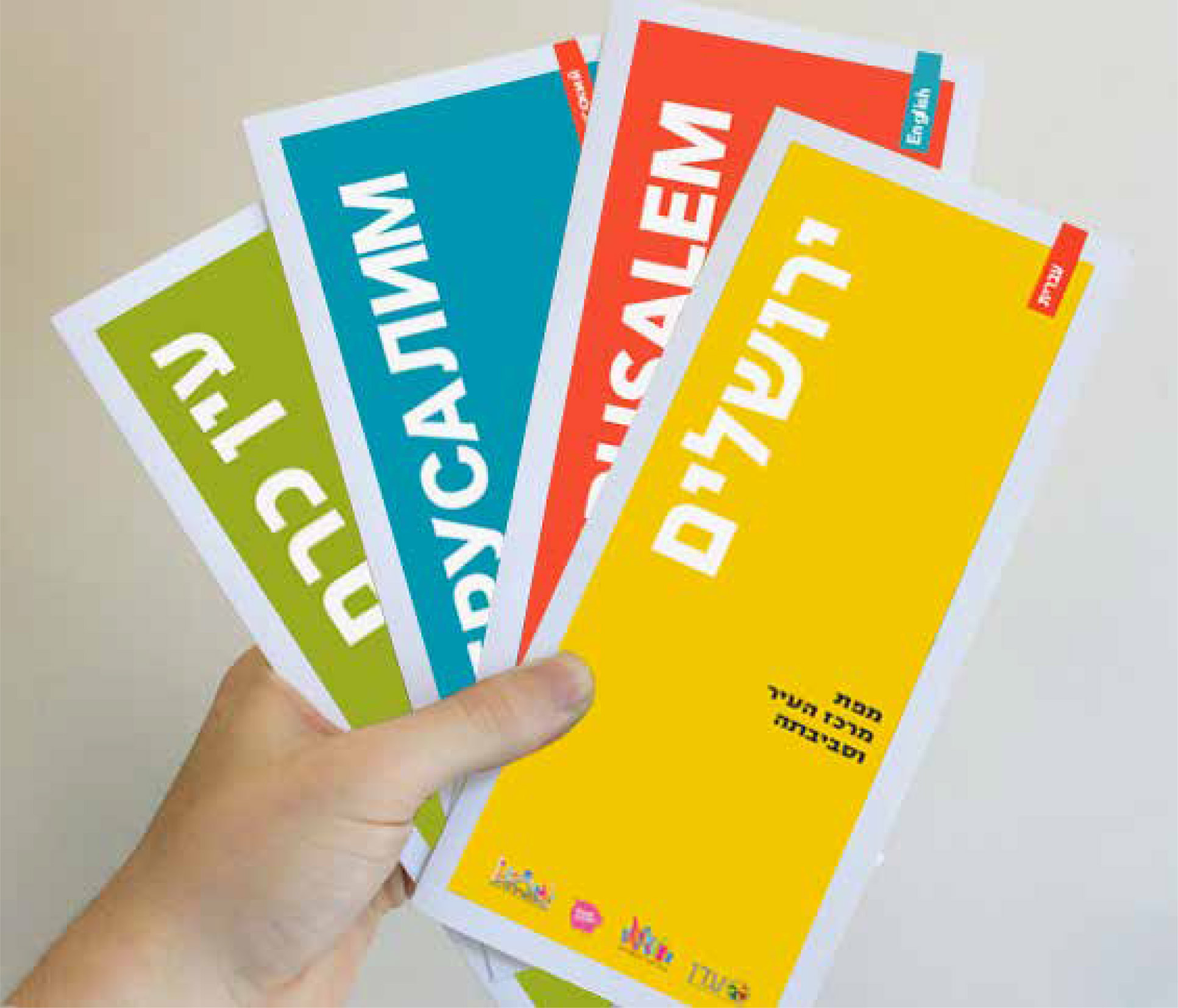
![Orientation leaflet]()
![Project's pictograms]()
![Project's pictograms]()
![Insert from the design drawing set]()
![Insert from the design drawing set]()
![Insert from the design drawing set]()
The first stage was devoted to documenting the existing situation, analyzing the results, and determining the ‘rules of the game.’ One of our immediate tasks was to sort out and catalogue the different kinds of signage in use, divide them into groups, and define their purpose. In this way we significantly reduced the number of types of signs scattered throughout the city. The next stage was the separation of signs in the private sector (advertisements, commercial signs, etc.) from those intended for the public domain (directional signs, for example).
Rachelle Wiener’s team mapped the area, highlighting the entrances to the city and ranking traffic routes according to the city’s existing transportation masterplan. Mapping the street system identified a network of arterial roads that lead to and across the city center, and connect neighborhoods. The ever-expanding city of Jerusalem is a city of neighborhoods, and therefore the demarcation of each was important, both at the level of local identity, and at the level of wayfinding in the city.

“The most prominent color used on the signs is a grayish green, suggestive of the olive trees that are native to the hills around Jerusalem”
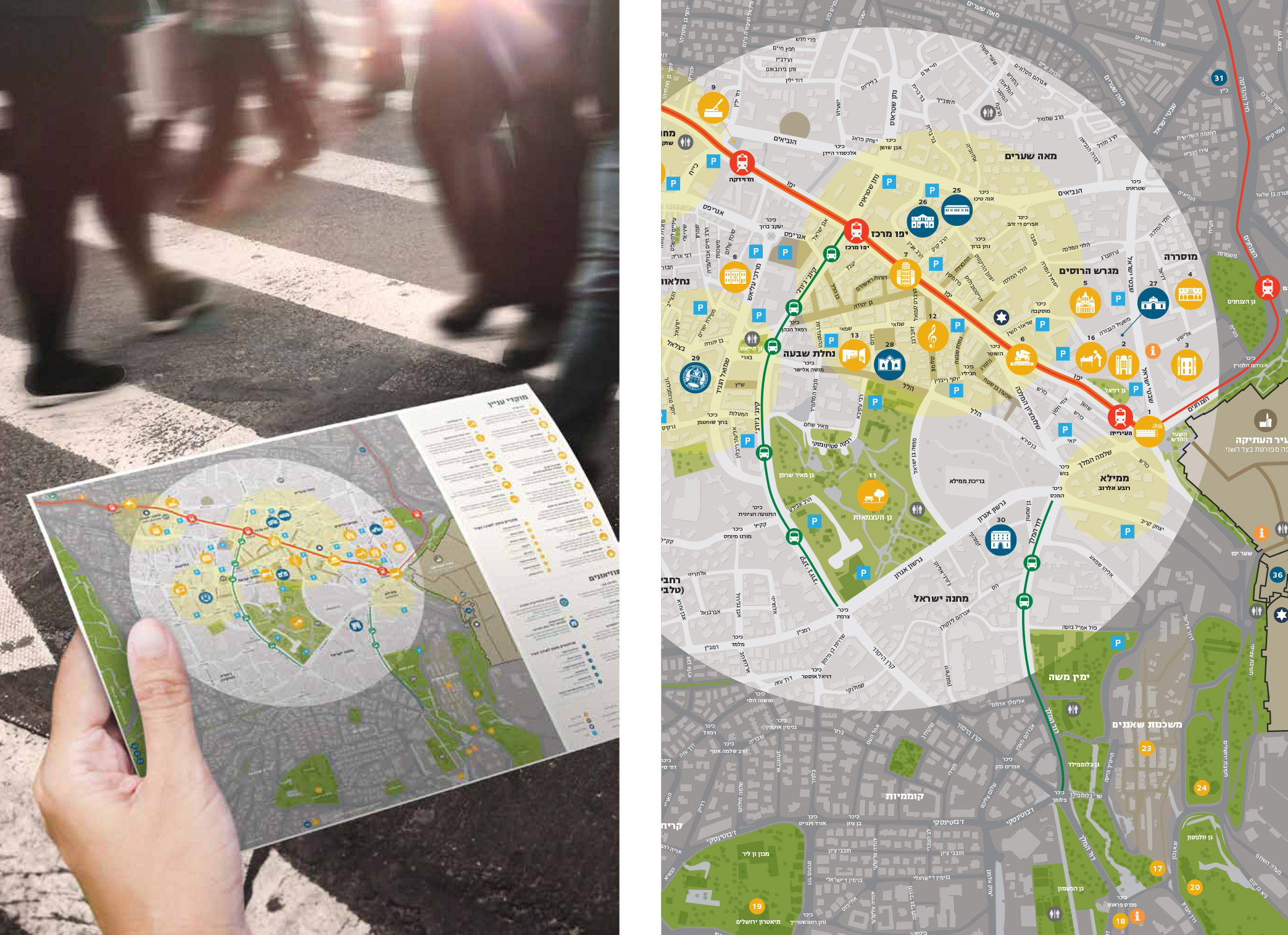
And more. Jerusalem is an important tourist destination for Israelis and foreign visitors alike. A major part of destinations on directional signs are centers of tourism and culture that draw crowds. In accordance with the city’s urban planning concept, these centers have been marked for pedestrian traffic only: drivers have to park outside the area and explore the attractions on foot.
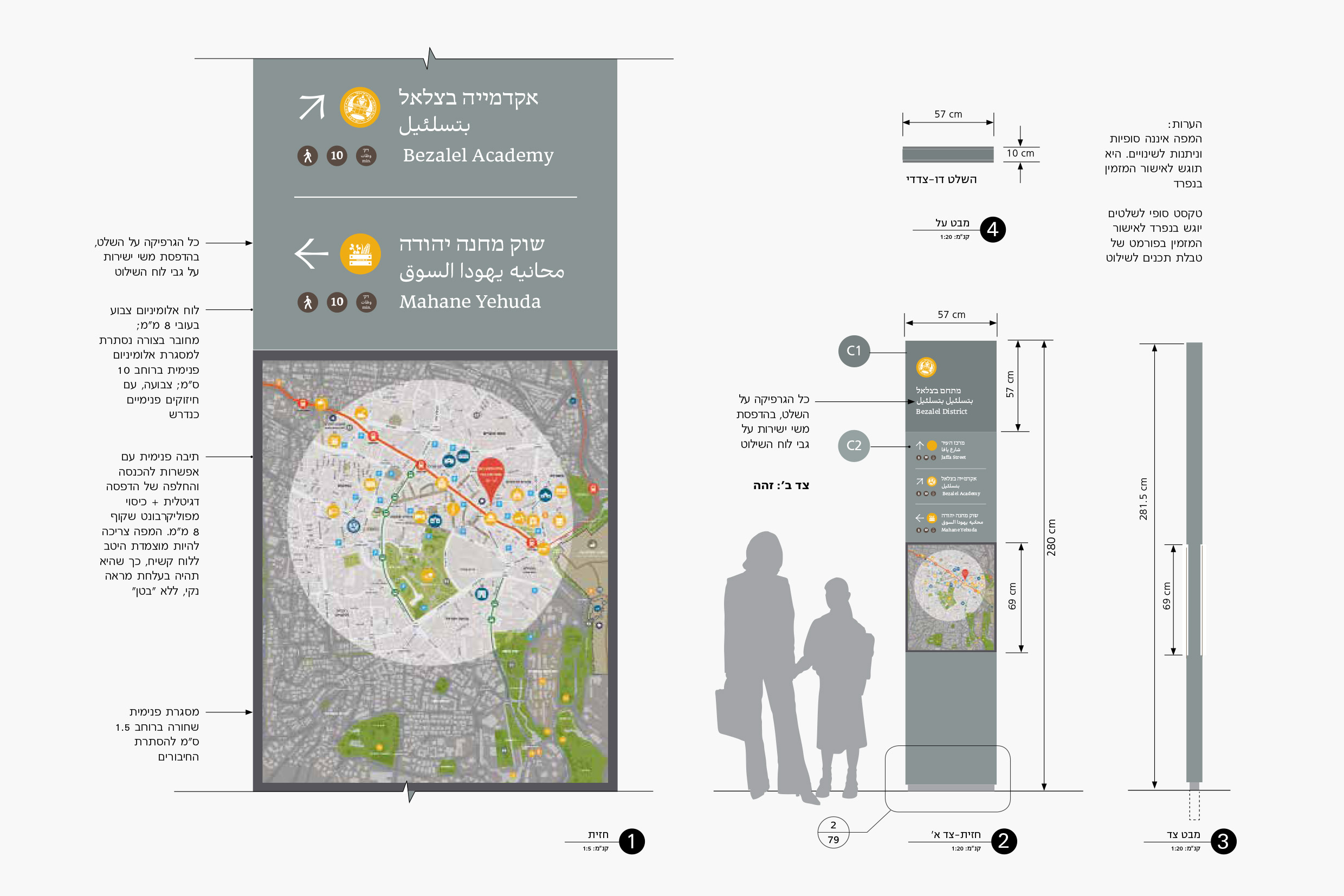
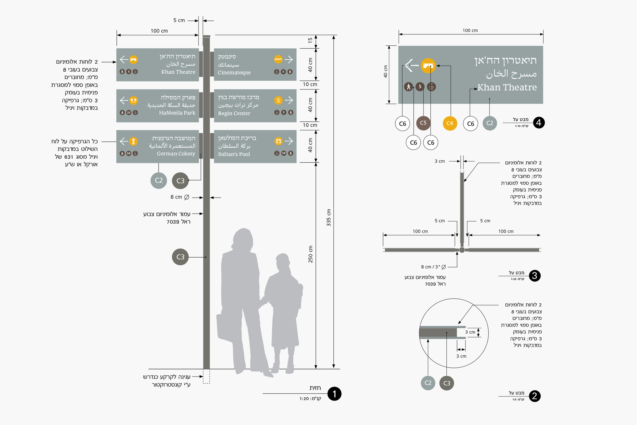
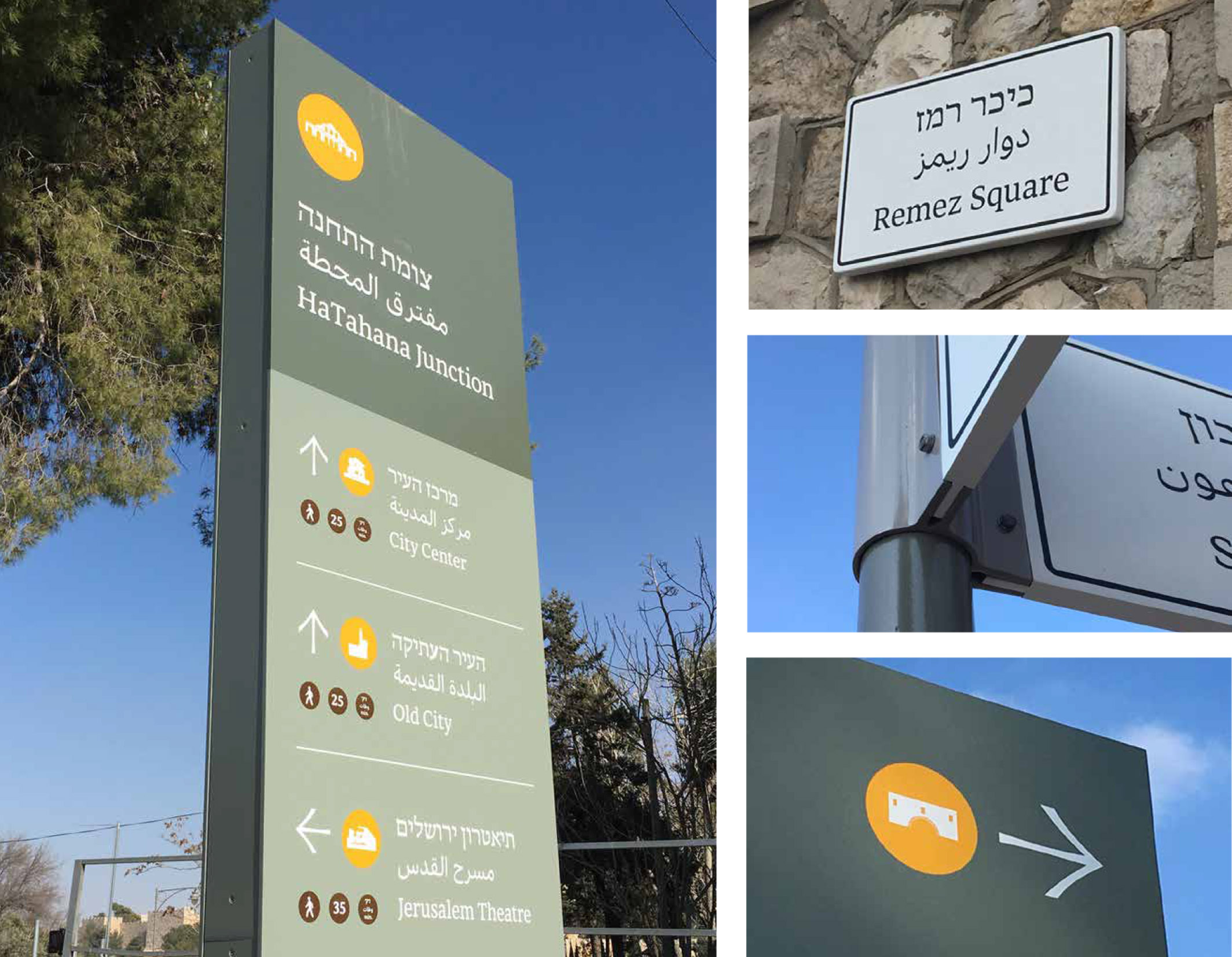
In the final stages, the system included identification signs (names of neighborhoods, streets and squares); directional signs for pedestrians and drivers; “totem” signs that include a wayfinder area map; and tourism and heritage signage. The design of the wayfinding system is characterized by clean lines, restrained but very legible use of color, and classic typography. The most prominent color used on the signs is a grayish green, suggestive of the olive trees that are native to the hills around Jerusalem. The font chosen was ‘Hadassah Friedlaender,’ a classic serif-type, recently revived by typographer Yanek Iontef.
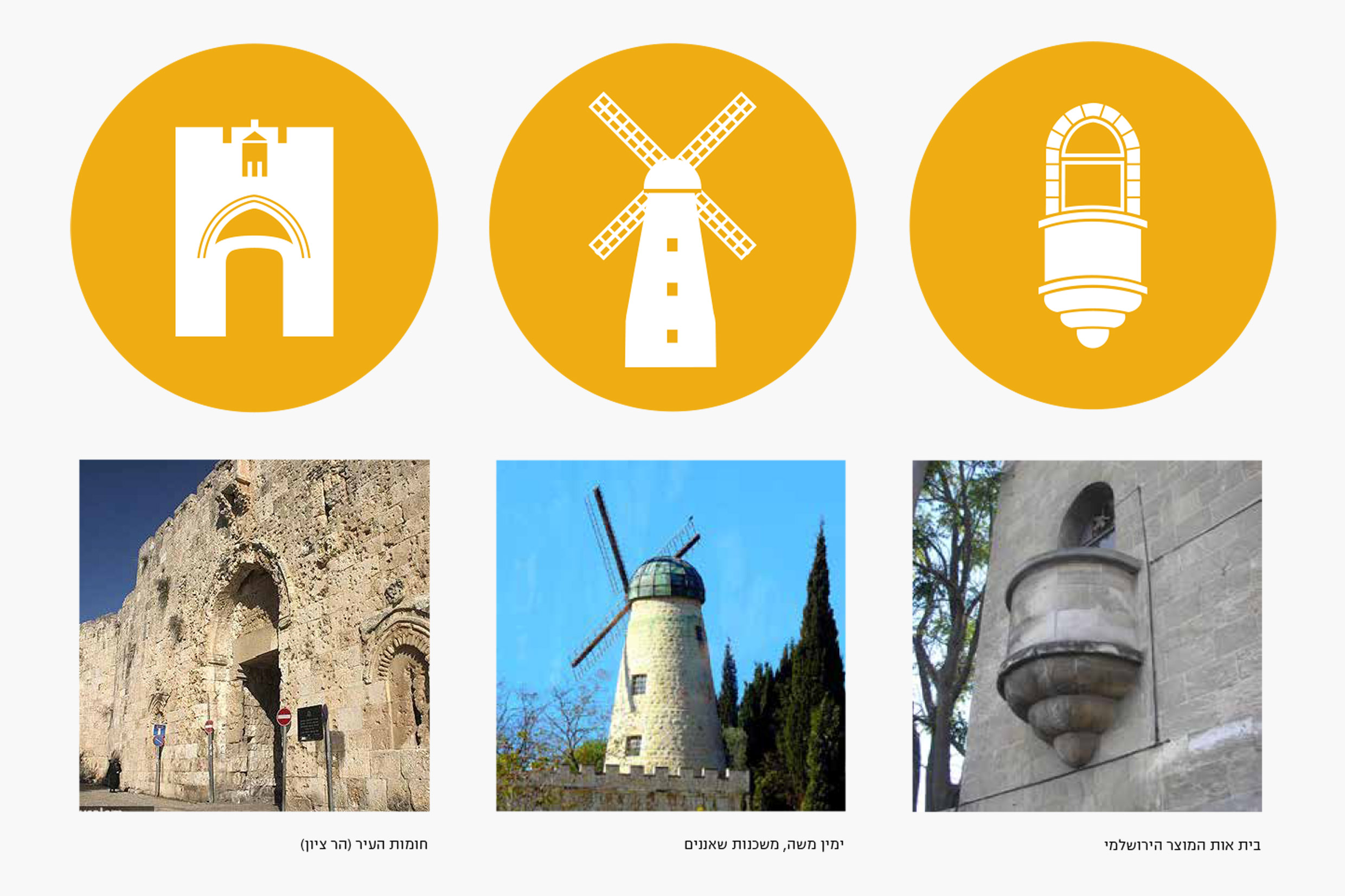
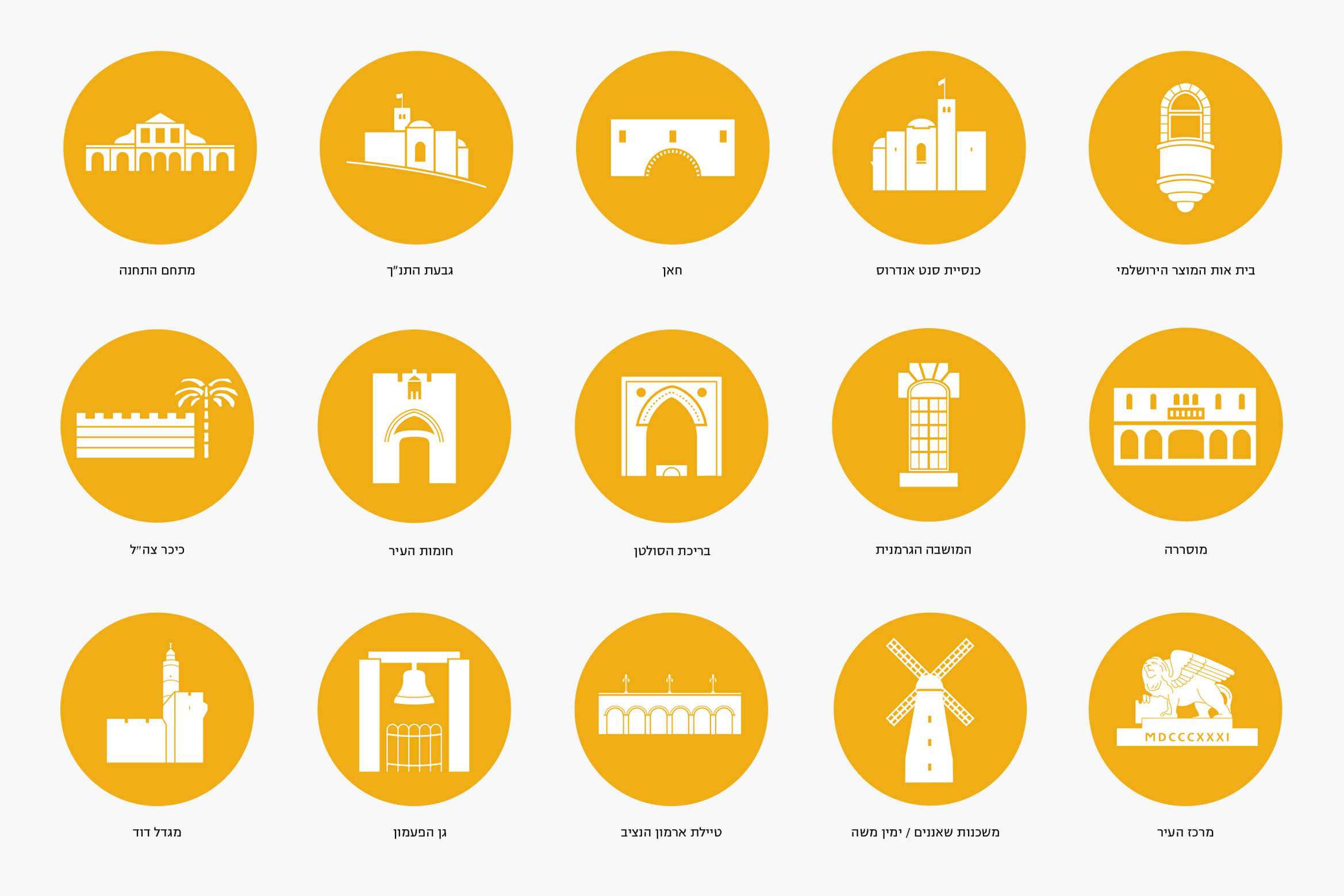
A central feature of the project was the use of pictograms, simple graphic symbols that depict selected places and sites like Mishkenot Sha’ananim, the Khan Theater and Sultan’s Pool. The pictogram allows immediate recognition of the destination, sometimes without a need for the accompanying text. A good example is the Montefiore Windmill in Yemin Moshe. We completed the signage system with a wayfinding map for the city center, which utilizes the same pictograms and visual language.
Tel Aviv’s Auditorium: ‘Heichal Hatarbut’
Wednesday, February 26, 2020
Restoration of the historical sign on the façade
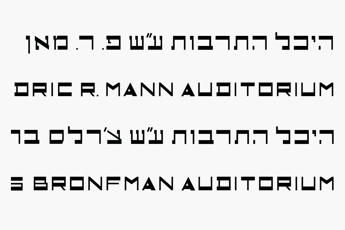
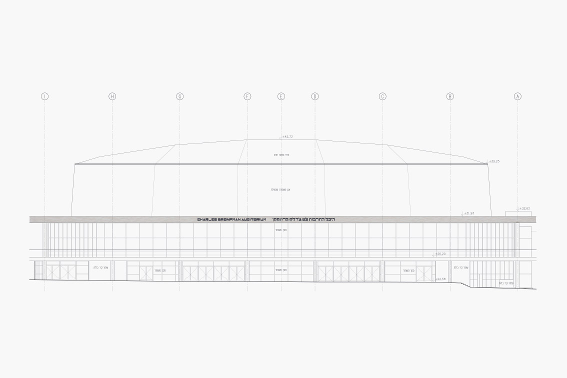
Tel Aviv’s Auditorium, known in Hebrew as “Heichal Hatarbut,” is considered an architectural icon in the city, as described in the text accompanying this project. Opened in 1957, the building was designed in the popular “brutalistic” style of the period by architects Dov Carmi, Zeev Rechter and Yacov Rechter. From the beginning the Auditorium was named in honor of its major patron, Fredric R. Mann, a name still unfamiliar to many locals.
Years passed, and the Auditorium – the home of the Israel Philharmonic – desperately needed restoration and renewal. Philanthropist Charles Bronfman stepped forward and underwrote the project. With the completion of a thorough makeover by the Kolker Kolker Epstein architectural firm, the building was rededicated in 2012, and, as agreed in the contract, its name was changed to that of its new patron: the Charles Bronfman Auditorium.
The name sign that graces the upper façade of the auditorium is itself so iconic that the building would seem strange without it. In changing the wording of the sign, we felt obliged to preserve its original appearance and special typography. The lettering on the sign does not follow a familiar font, but was apparently designed especially for this project. Attempts to trace the original designers were in vain. We approached the two architectural firms, Carmi and Rechter, for archival information about the design of the lettering, but regrettably nothing was found.
![]()
![]()
![]()
![]()
![]()
![]()
![]()
![Typographic studies]()
Years passed, and the Auditorium – the home of the Israel Philharmonic – desperately needed restoration and renewal. Philanthropist Charles Bronfman stepped forward and underwrote the project. With the completion of a thorough makeover by the Kolker Kolker Epstein architectural firm, the building was rededicated in 2012, and, as agreed in the contract, its name was changed to that of its new patron: the Charles Bronfman Auditorium.
The name sign that graces the upper façade of the auditorium is itself so iconic that the building would seem strange without it. In changing the wording of the sign, we felt obliged to preserve its original appearance and special typography. The lettering on the sign does not follow a familiar font, but was apparently designed especially for this project. Attempts to trace the original designers were in vain. We approached the two architectural firms, Carmi and Rechter, for archival information about the design of the lettering, but regrettably nothing was found.


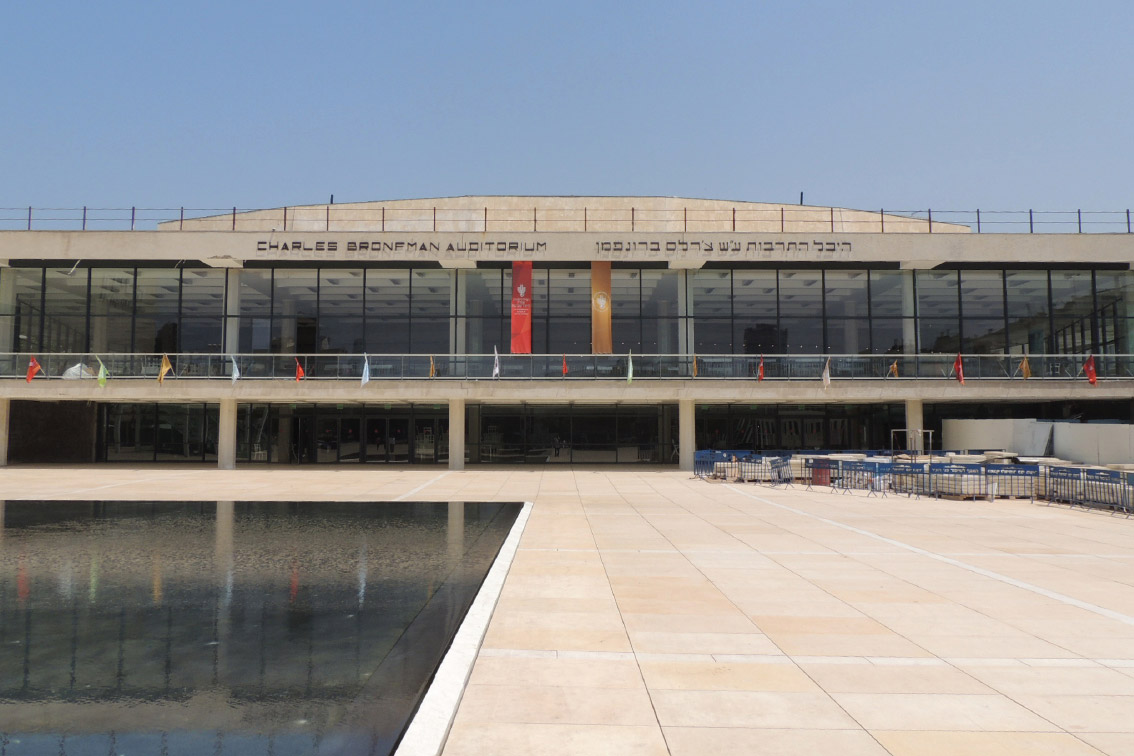
“We approached the two architectural firms, Carmi and Rechter, for archival information about the design of the lettering, but regrettably nothing was found”
Our assumption was that the letters were created by a draftsman or -woman in Carmi and Rechter’s office who may have shown a flair for graphic design and worked under the supervision of the project architects – or perhaps even under the head architects themselves, who knows? We discovered that the letters were drawn on a relatively simple grid, composed of thick upper and lower horizontal lines, thin vertical lines, and diagonal lines of varying thickness. Based on this grid, we designed the letters still needed to complete the new name.
The original brass letters had darkened with time, and taken on the dark brown hue seen in photographs before the removal of the sign. The brass was just a few millimeters thick, extremely thin compared to the height of the letters (about 35cms). The entire sign was physically separated from the eastern façade of the building, and attached from behind with thin pins. This gave it the appearance of ‘floating,’ which was part of the charm of the original design. In our restoration of the sign we too used brass, darkened artificially by an oxidation process to reproduce the tone of the original lettering before its removal.
Brass is a wonderful material because of its characteristic quality of changing color from a golden hue to almost black. It can also be identified with the brass section of the orchestra whose home this is, and so we adopted it as the material of choice for the interior signage as well, using different tone levels. Against a wood background, for example, we used gilded brass, but preferred a darkened tone on the concrete pillars.


7 Ha’Kalaniot St.
Kiryat Tivon 30652
Israel
Kiryat Tivon 30652
Israel
Tel: +972 (77) 4070 933
Fax: +972 (77) 4070 955
Fax: +972 (77) 4070 955