Jerusalem Sign Masterplan
Monday, April 20, 2020
Bringing order to disorder
The sign masterplan for central Jerusalem is designed to provide information in public areas, with an emphasis on directional and wayfinding signs. The project was launched in 2010 by Eden, the Jerusalem Center Development Company. The interdisciplinary planning team included project manager Aviad Sar-Shalom, landscape architect Rachelle Wiener, transportation engineer Roli Roshfeld, and ourselves – Kasher Design – responsible for visual communications and wayfinding. With Aviad’s departure for Canada, Avidan Elzas of Hass Engineering took over as team leader. Subsequently, as the project expanded, Doron Rachlevsky was appointed as its director.
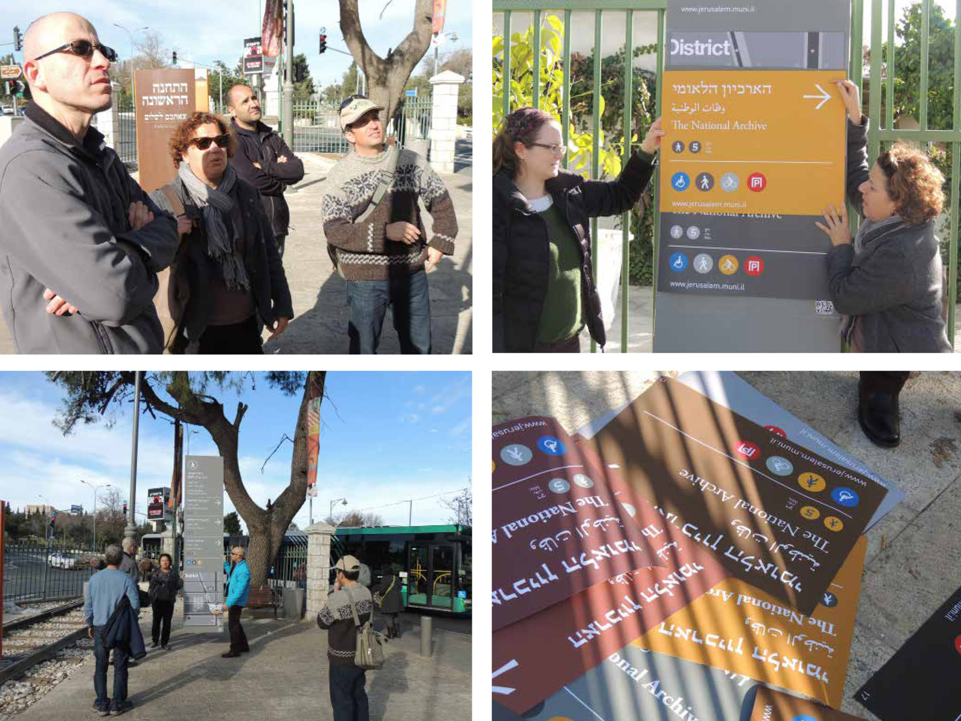
The first stage was devoted to documenting the existing situation, analyzing the results, and determining the ‘rules of the game.’ One of our immediate tasks was to sort out and catalogue the different kinds of signage in use, divide them into groups, and define their purpose. In this way we significantly reduced the number of types of signs scattered throughout the city. The next stage was the separation of signs in the private sector (advertisements, commercial signs, etc.) from those intended for the public domain (directional signs, for example).
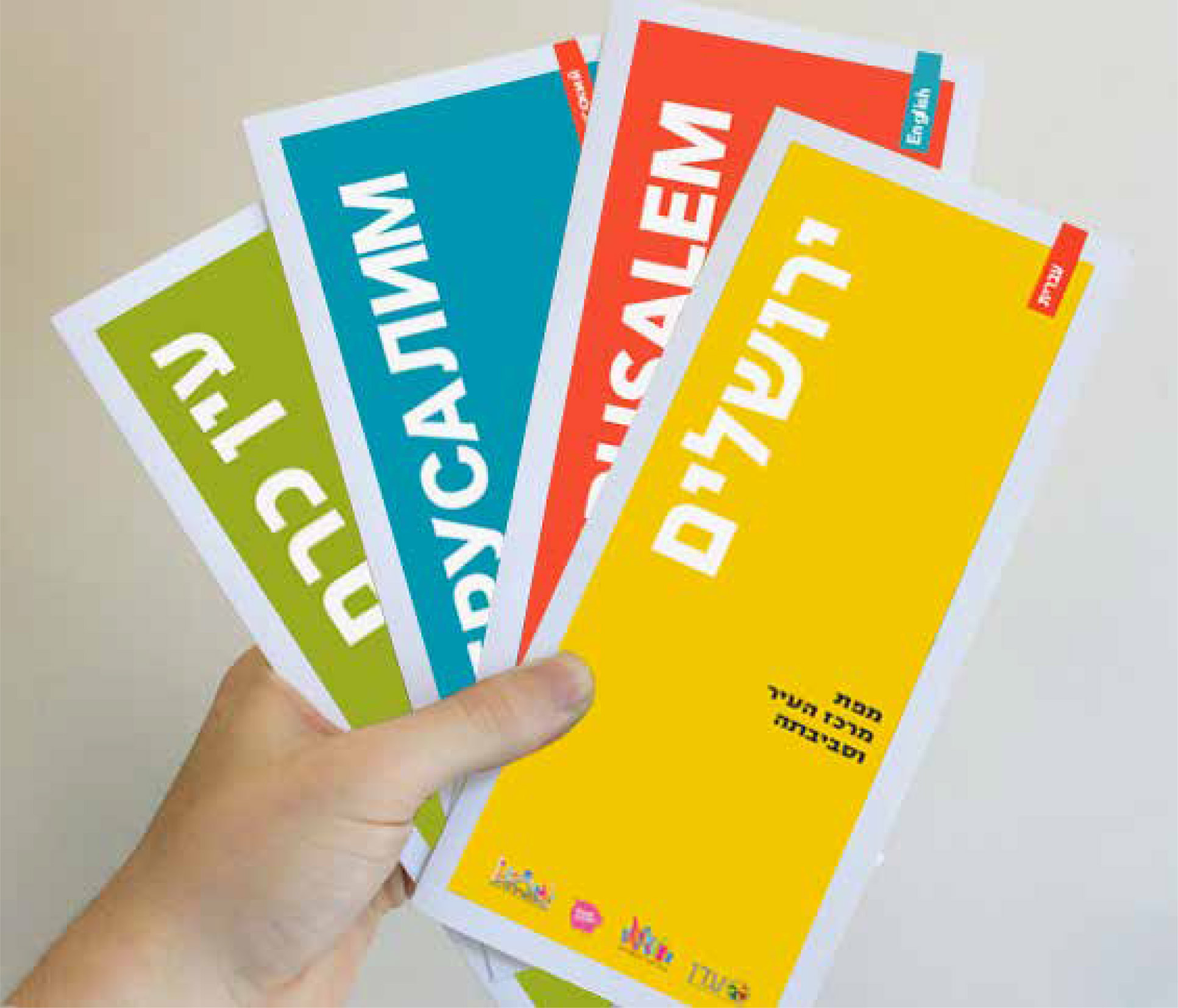
Rachelle Wiener’s team mapped the area, highlighting the entrances to the city and ranking traffic routes according to the city’s existing transportation masterplan. Mapping the street system identified a network of arterial roads that lead to and across the city center, and connect neighborhoods. The ever-expanding city of Jerusalem is a city of neighborhoods, and therefore the demarcation of each was important, both at the level of local identity, and at the level of wayfinding in the city.
![Orientation leaflet]()
![Project's pictograms]()
![Project's pictograms]()
![Insert from the design drawing set]()
![Insert from the design drawing set]()
![Insert from the design drawing set]()
The first stage was devoted to documenting the existing situation, analyzing the results, and determining the ‘rules of the game.’ One of our immediate tasks was to sort out and catalogue the different kinds of signage in use, divide them into groups, and define their purpose. In this way we significantly reduced the number of types of signs scattered throughout the city. The next stage was the separation of signs in the private sector (advertisements, commercial signs, etc.) from those intended for the public domain (directional signs, for example).
Rachelle Wiener’s team mapped the area, highlighting the entrances to the city and ranking traffic routes according to the city’s existing transportation masterplan. Mapping the street system identified a network of arterial roads that lead to and across the city center, and connect neighborhoods. The ever-expanding city of Jerusalem is a city of neighborhoods, and therefore the demarcation of each was important, both at the level of local identity, and at the level of wayfinding in the city.

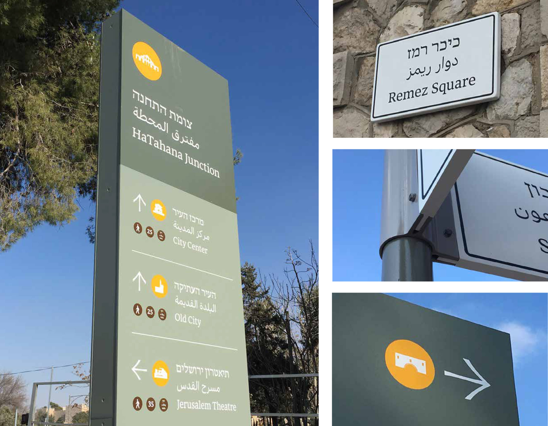
“The most prominent color used on the signs is a grayish green, suggestive of the olive trees that are native to the hills around Jerusalem”
And more. Jerusalem is an important tourist destination for Israelis and foreign visitors alike. A major part of destinations on directional signs are centers of tourism and culture that draw crowds. In accordance with the city’s urban planning concept, these centers have been marked for pedestrian traffic only: drivers have to park outside the area and explore the attractions on foot.
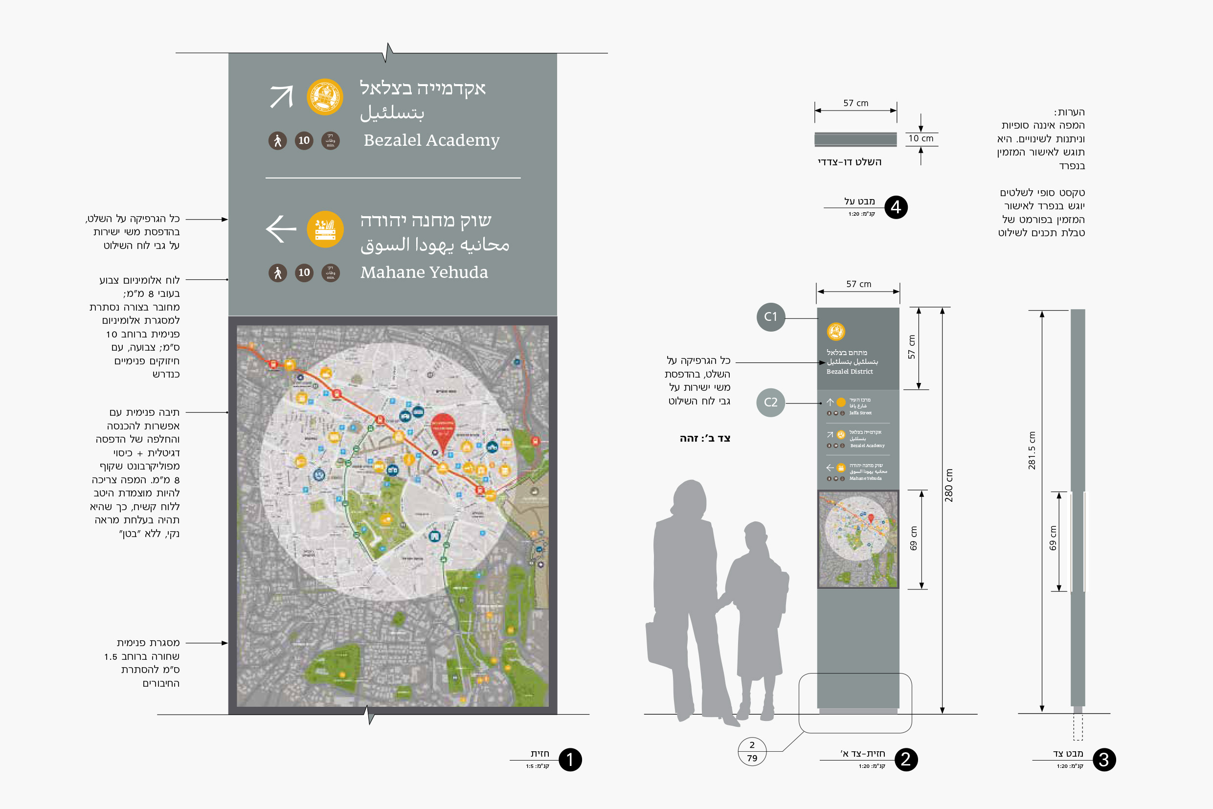
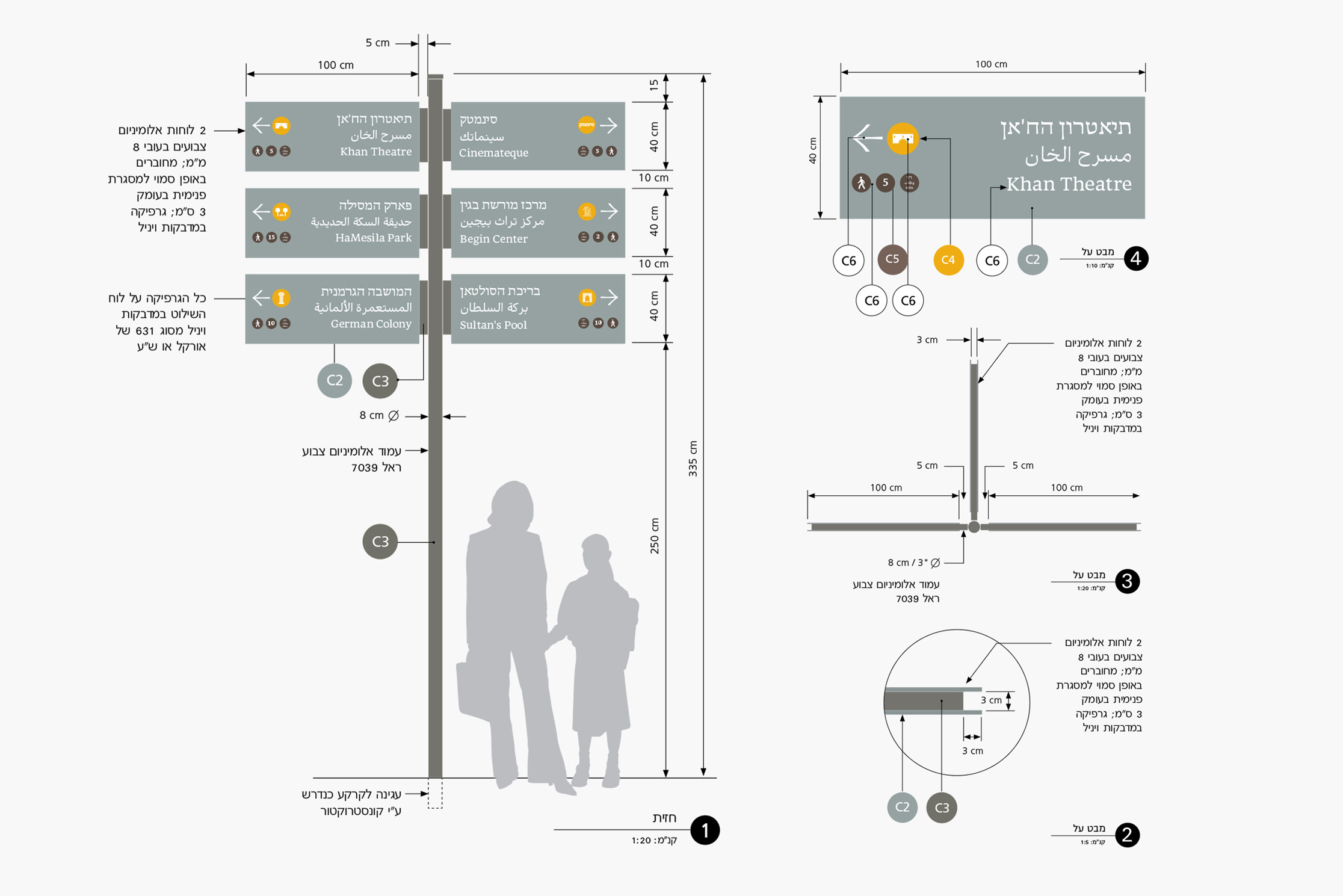
In the final stages, the system included identification signs (names of neighborhoods, streets and squares); directional signs for pedestrians and drivers; “totem” signs that include a wayfinder area map; and tourism and heritage signage. The design of the wayfinding system is characterized by clean lines, restrained but very legible use of color, and classic typography. The most prominent color used on the signs is a grayish green, suggestive of the olive trees that are native to the hills around Jerusalem. The font chosen was ‘Hadassah Friedlaender,’ a classic serif-type, recently revived by typographer Yanek Iontef.
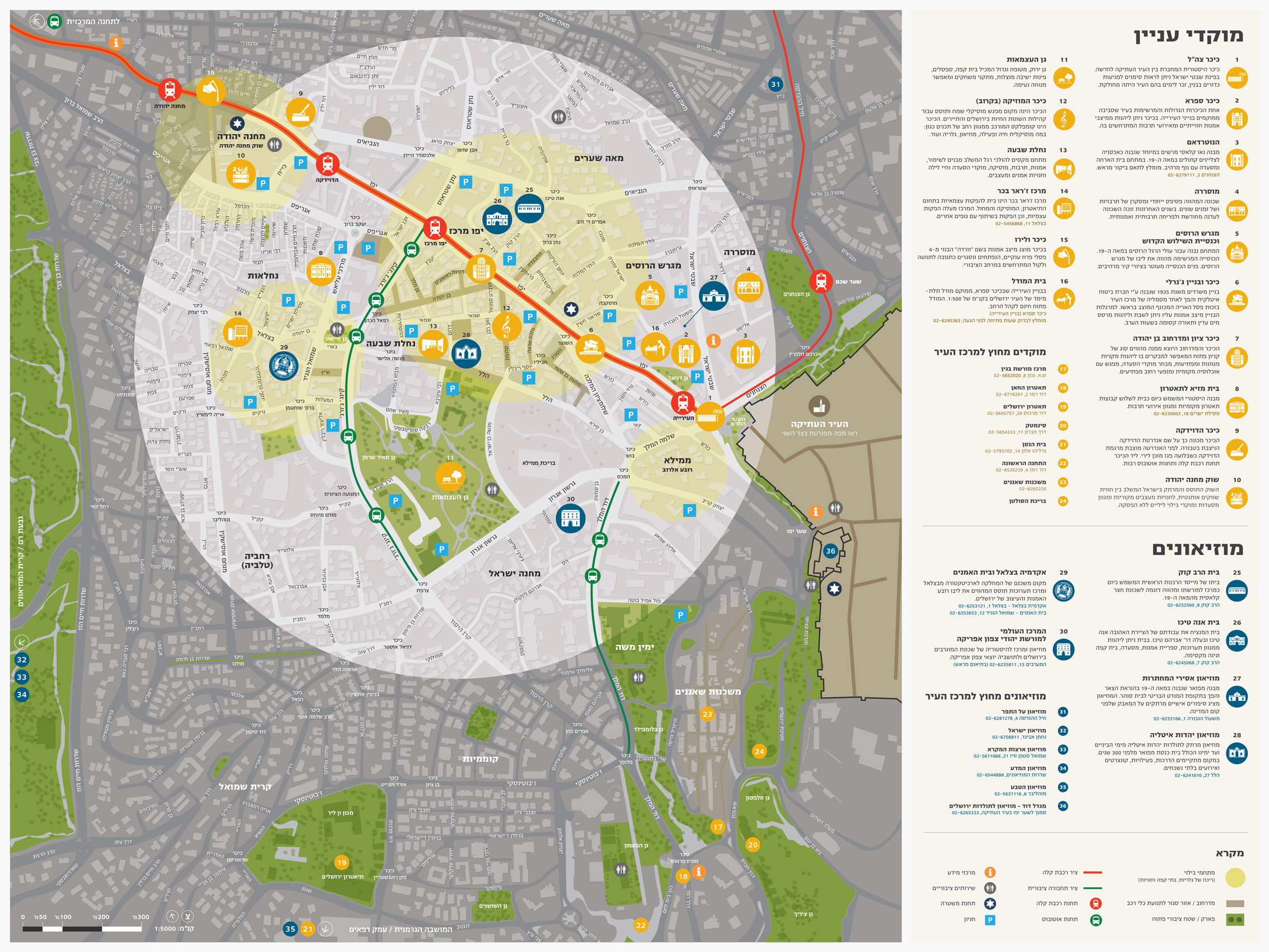
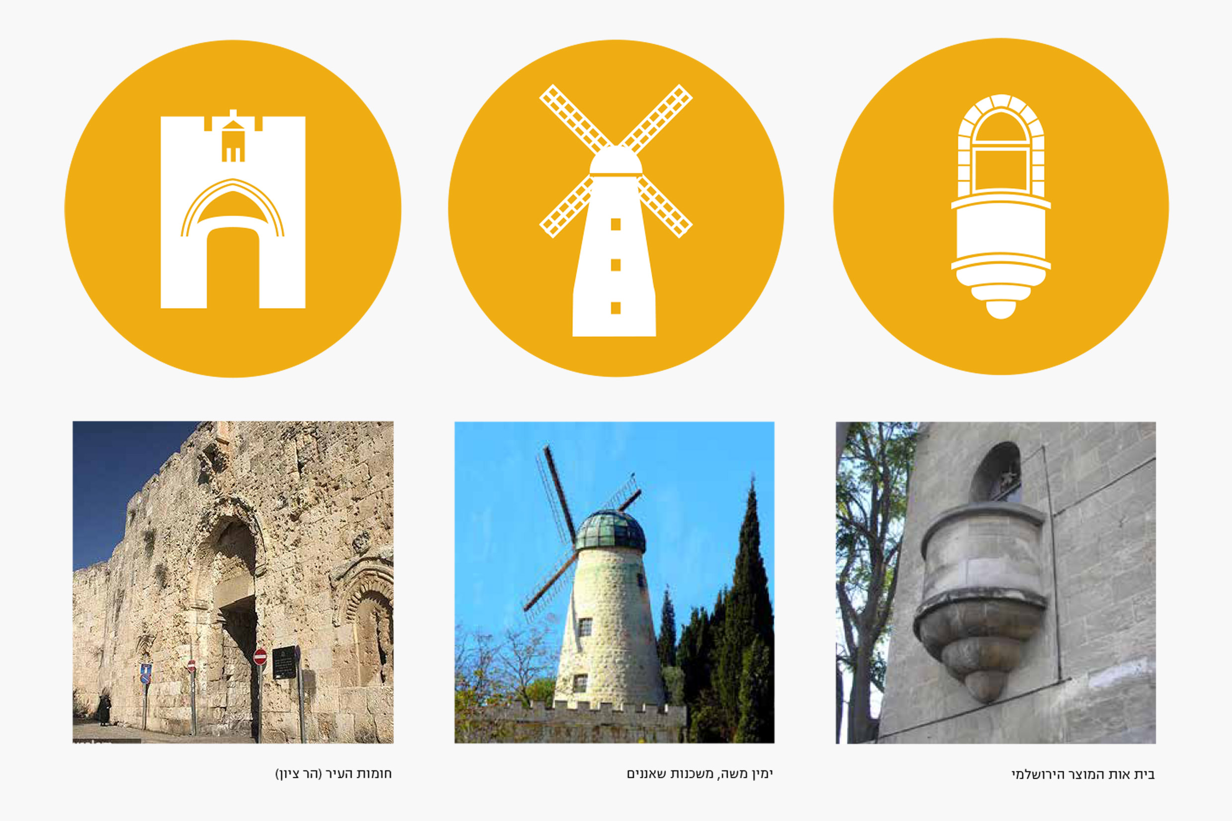
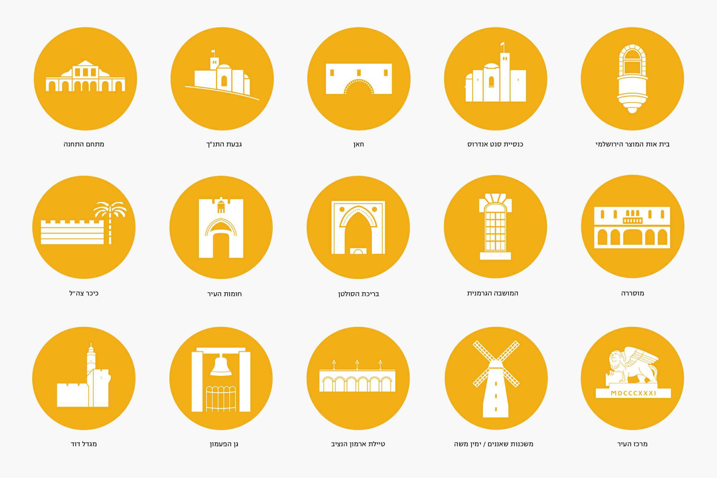
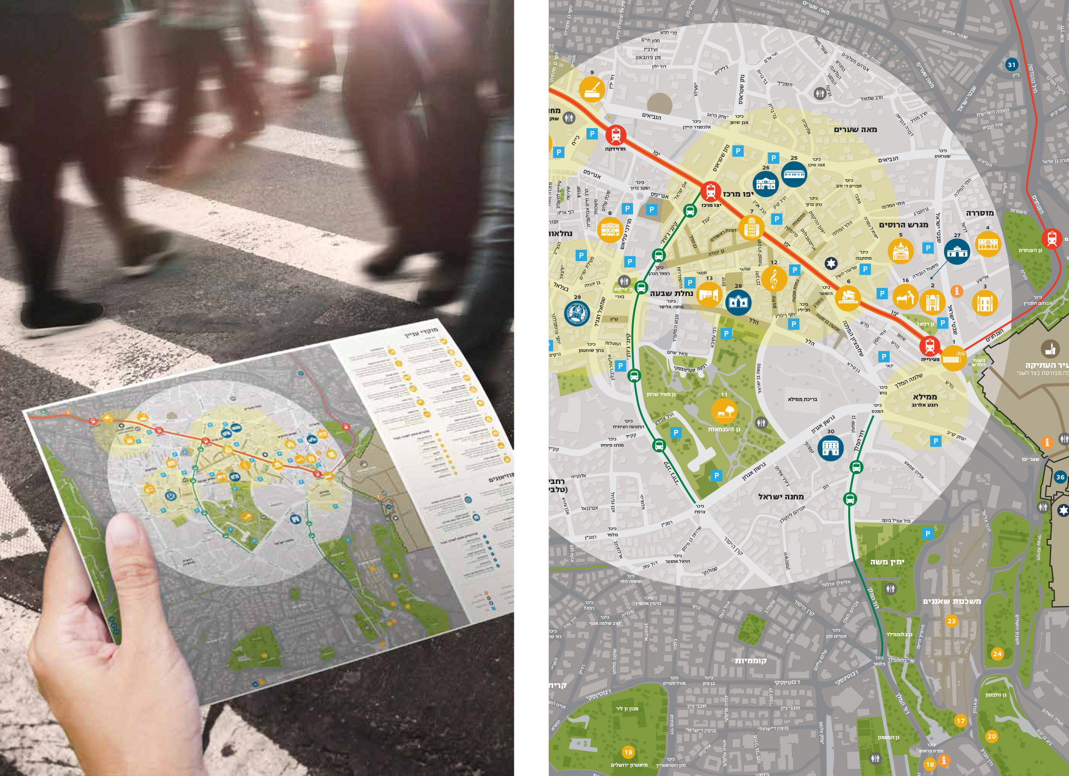
A central feature of the project was the use of pictograms, simple graphic symbols that depict selected places and sites like Mishkenot Sha’ananim, the Khan Theater and Sultan’s Pool. The pictogram allows immediate recognition of the destination, sometimes without a need for the accompanying text. A good example is the Montefiore Windmill in Yemin Moshe. We completed the signage system with a wayfinding map for the city center, which utilizes the same pictograms and visual language.
7 Ha’Kalaniot St.
Kiryat Tivon 30652
Israel
Kiryat Tivon 30652
Israel
Tel: +972 (77) 4070 933
Fax: +972 (77) 4070 955
Fax: +972 (77) 4070 955