Tel Aviv’s Auditorium: ‘Heichal Hatarbut’
Wednesday, February 26, 2020
Restoration of the historical sign on the façade
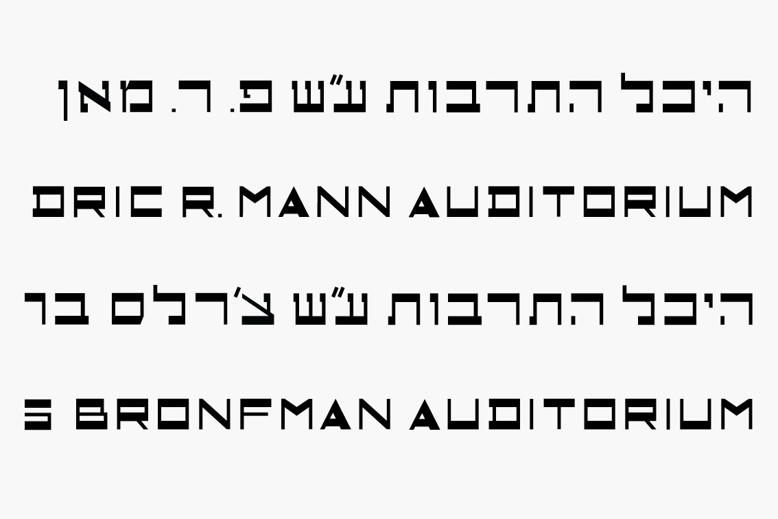
Tel Aviv’s Auditorium, known in Hebrew as “Heichal Hatarbut,” is considered an architectural icon in the city, as described in the text accompanying this project. Opened in 1957, the building was designed in the popular “brutalistic” style of the period by architects Dov Carmi, Zeev Rechter and Yacov Rechter. From the beginning the Auditorium was named in honor of its major patron, Fredric R. Mann, a name still unfamiliar to many locals.
Years passed, and the Auditorium – the home of the Israel Philharmonic – desperately needed restoration and renewal. Philanthropist Charles Bronfman stepped forward and underwrote the project. With the completion of a thorough makeover by the Kolker Kolker Epstein architectural firm, the building was rededicated in 2012, and, as agreed in the contract, its name was changed to that of its new patron: the Charles Bronfman Auditorium.
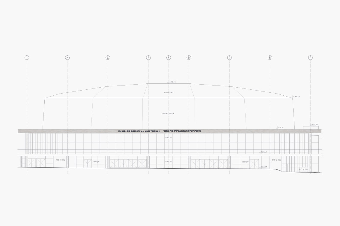
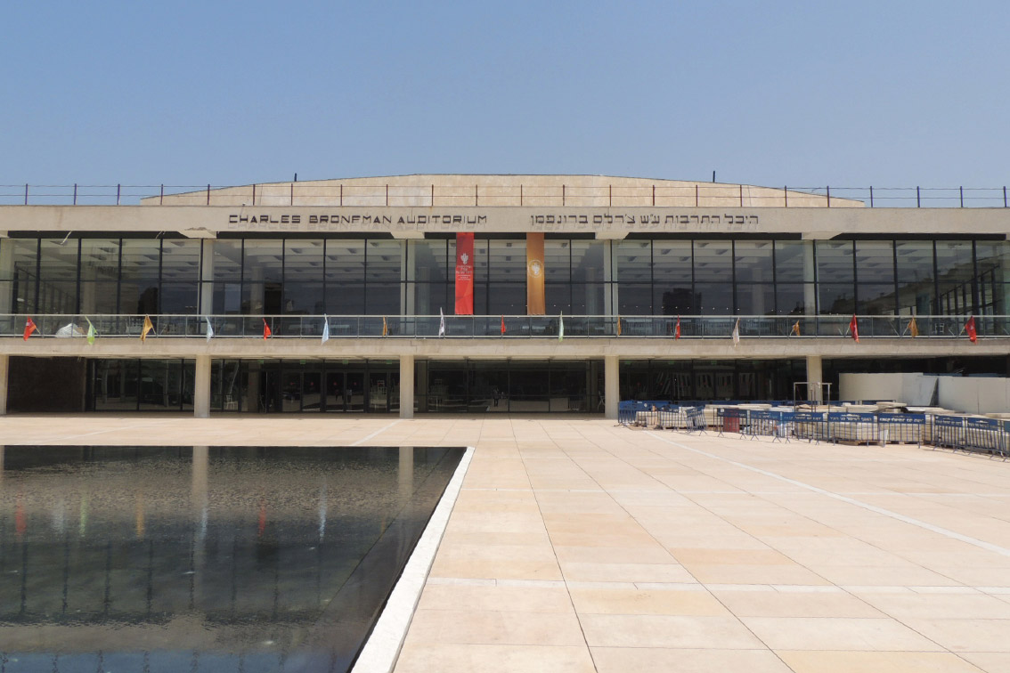
The name sign that graces the upper façade of the auditorium is itself so iconic that the building would seem strange without it. In changing the wording of the sign, we felt obliged to preserve its original appearance and special typography. The lettering on the sign does not follow a familiar font, but was apparently designed especially for this project. Attempts to trace the original designers were in vain. We approached the two architectural firms, Carmi and Rechter, for archival information about the design of the lettering, but regrettably nothing was found.
![]()
![]()
![]()
![]()
![]()
![]()
![]()
![Typographic studies]()
Years passed, and the Auditorium – the home of the Israel Philharmonic – desperately needed restoration and renewal. Philanthropist Charles Bronfman stepped forward and underwrote the project. With the completion of a thorough makeover by the Kolker Kolker Epstein architectural firm, the building was rededicated in 2012, and, as agreed in the contract, its name was changed to that of its new patron: the Charles Bronfman Auditorium.
The name sign that graces the upper façade of the auditorium is itself so iconic that the building would seem strange without it. In changing the wording of the sign, we felt obliged to preserve its original appearance and special typography. The lettering on the sign does not follow a familiar font, but was apparently designed especially for this project. Attempts to trace the original designers were in vain. We approached the two architectural firms, Carmi and Rechter, for archival information about the design of the lettering, but regrettably nothing was found.


“We approached the two architectural firms, Carmi and Rechter, for archival information about the design of the lettering, but regrettably nothing was found”
Our assumption was that the letters were created by a draftsman or -woman in Carmi and Rechter’s office who may have shown a flair for graphic design and worked under the supervision of the project architects – or perhaps even under the head architects themselves, who knows? We discovered that the letters were drawn on a relatively simple grid, composed of thick upper and lower horizontal lines, thin vertical lines, and diagonal lines of varying thickness. Based on this grid, we designed the letters still needed to complete the new name.
The original brass letters had darkened with time, and taken on the dark brown hue seen in photographs before the removal of the sign. The brass was just a few millimeters thick, extremely thin compared to the height of the letters (about 35cms). The entire sign was physically separated from the eastern façade of the building, and attached from behind with thin pins. This gave it the appearance of ‘floating,’ which was part of the charm of the original design. In our restoration of the sign we too used brass, darkened artificially by an oxidation process to reproduce the tone of the original lettering before its removal.
Brass is a wonderful material because of its characteristic quality of changing color from a golden hue to almost black. It can also be identified with the brass section of the orchestra whose home this is, and so we adopted it as the material of choice for the interior signage as well, using different tone levels. Against a wood background, for example, we used gilded brass, but preferred a darkened tone on the concrete pillars.


7 Ha’Kalaniot St.
Kiryat Tivon 30652
Israel
Kiryat Tivon 30652
Israel
Tel: +972 (77) 4070 933
Fax: +972 (77) 4070 955
Fax: +972 (77) 4070 955